It’s not a design problem – The exact words I told the marketing team after weeks of investigating why we had a 58% churn rate on the Eversend app after the first open
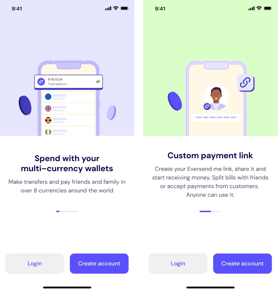
Marketing was convinced that the reason we had this alarming churn rate was that the app onboarding screens were not convincing enough

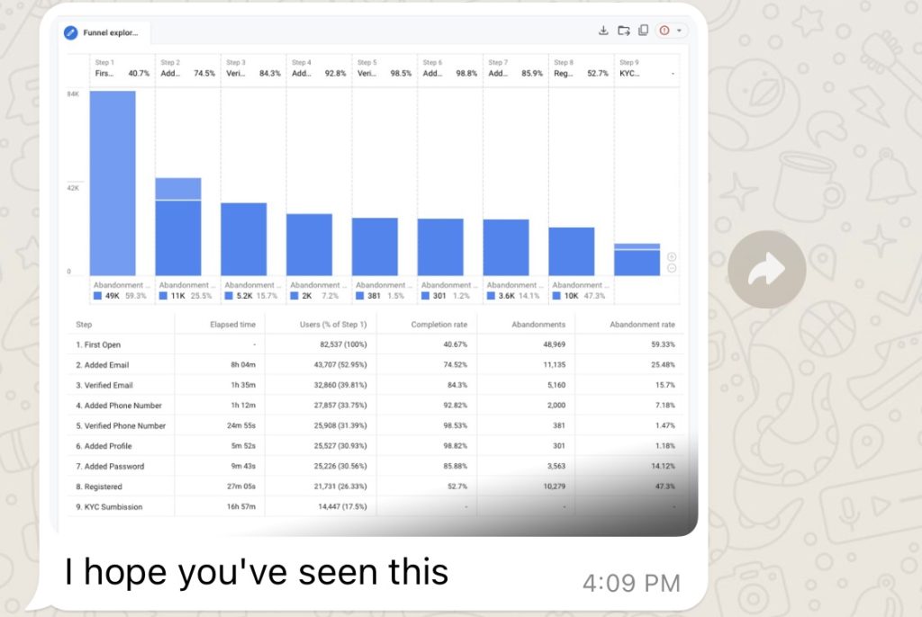
To understand if this was a hypothesis I collaborated with the data team and did a deep dive into our acquisition funnel to get granular details backdating three months, with a sample size 24,499 users
Of the 24,499 who first opened
- 18,065 saw the onboarding (74%)
- 1,908 were returning users (8%)
- 11,067 were new users that added email (45%)
- Only 7,043 verified email (33%)
above my findings led me to the fact that
A significant 58% drop-off was observed between users adding an email and completing the email verification process.
Mailgun shows that it’s doing its job of delivery, open rates are low. This could mean they do not know where to look or that the emails go to SPAM.
A strikingly brief average time of less than 3 seconds spent on our onboarding screens, coupled with a staggering 90% skip rate on these slides.
Users from organic installs or referrals demonstrated robust engagement, with 90% successfully navigating through the funnel and completing the initial value exchange of adding money, resulting in significant stickiness.
In contrast, less than 40% of users from paid channels like CPC completed the onboarding process, with many dropping off or failing to complete KYC verification, often flagged for submitting questionable documents.
Solution
We identified an alternative solution to address user churn after encountering initial setbacks with our first approach. This solution involved a 3-pronged approach:
Targeted Re-engagement: We implemented automated email and phone call reminders for users who churned after providing contact information. This personalized outreach aimed to re-engage users and potentially salvage their experience.
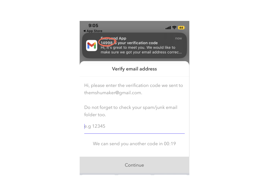
Personalization Through Design: To address these concerns, I proposed including the user’s unique OTP code prominently within the email header. This design decision aimed to:Increase Personalization: By displaying the OTP code, users would instantly recognize the email’s relevance to their account, potentially sparking their interest.

Improved Targeting: By analyzing user data more thoroughly, I gained valuable insights into user behavior. These insights were shared with the marketing team, enabling them to refine their retargeting efforts and focus on user segments most likely to benefit from the product.
User-Centric Design: It’s crucial to consider user experience throughout the entire process, including verification workflows.
lessons Learned:
- User Testing is Crucial: Testing potential solutions with real users provides invaluable feedback and helps identify issues before full-scale implementation.
Data-Driven Decisions: Thorough data analysis is essential for understanding user behavior and informing effective design and development decisions.